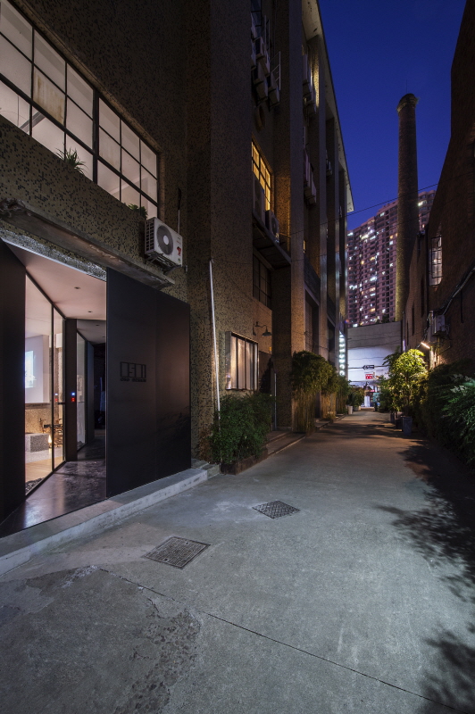
▲Exterior of Jin Xuanmin Studio
The brand-new space renovated by the studio of Mr. Jin is absolutely an extraordinary combination of small space, broad view and extreme simplicity. The artful connection between zones and the mix-and-match, alternation and arrangement of blocks make the whole space look flexible and varied.
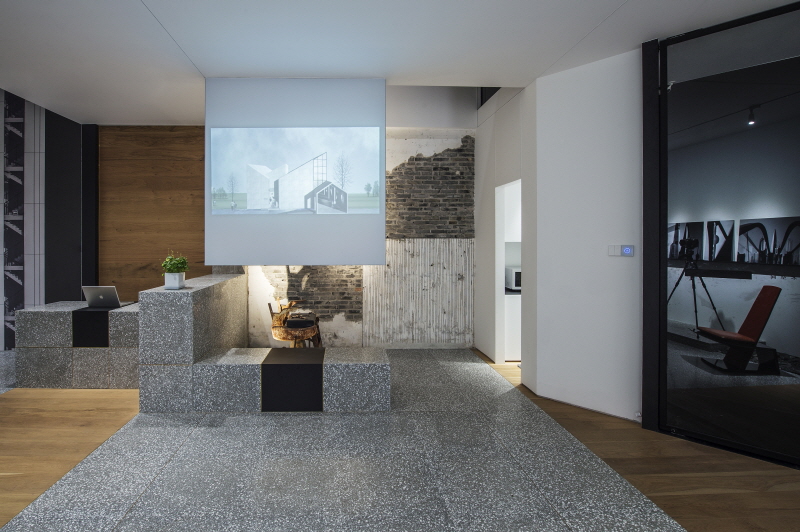
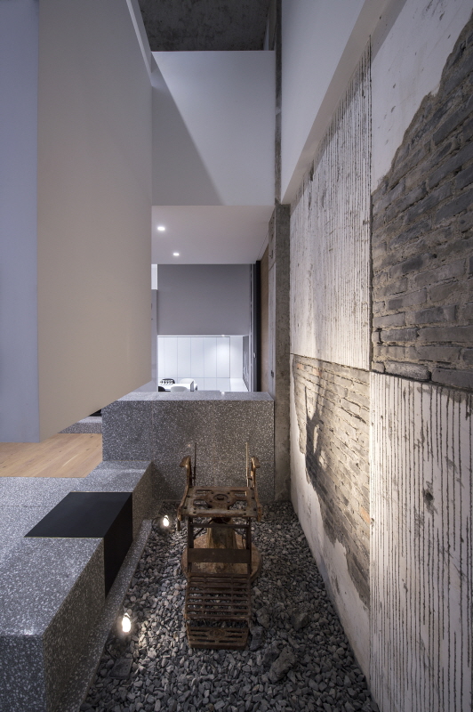
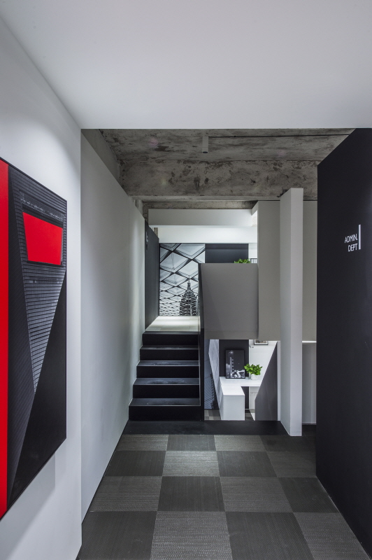
Before renovation, it was a rectangular space of 12m×6m, with a storey height of 6m. Thanks to Jin’s “one into five” layering design, it has been changed into a space of 160 m2 with much higher use ratio. As a black steel staircase wriggle upward, five storeys appear in front of us. The “sky well” connects the spaces up and down, on the left and on the right just like a staircase. It also forms a transparent space. On the first floor, there is an open exhibition hall, a sunken meeting room, rest rooms and a blank door leading into a storage room right under the staircase. The sunken meeting room is 40cm lower than the floor surface, leaving enough height for each storey.
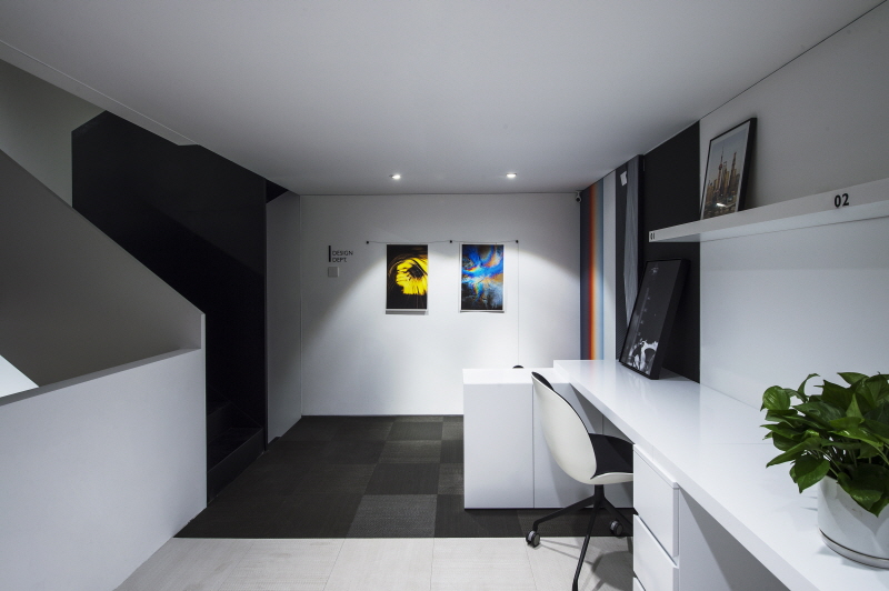
Overall, the space adopts large areas of terrazzo and small areas of wood panels, keeping a balance between cold tone and warm tone. As climbing the staircase, you can see three office areas of different functions and one reception room formed by the staggered floors. Black, white and grey are used as the dominant tone, which is quite clear and simple. The wallpaper and decorative pictures inside the space are all original photography works of Mr. Jin. Most of them are building photos and properly highlight the style of the whole space; the strong color contrast in those pictures brings vitality to the space, which also echoes with the “new-old” contrast. The roof of the top storey retains its previous motley. All these are elements forming this space “full of artistic atmosphere”. Staggered zones, alternated blocks, upright patio and contrast between the new and the old all add unique artistic air to this space!



0개의 댓글
댓글 정렬